4 Attention-Grabbing Examples of User-Generated Content in Ecommerce
User-generated content (UGC), like customer photos and reviews, increases engagement, encourages shoppers to convert into buyers and boosts word-of-mouth marketing. While there are many ways to display UGC throughout your site to create interest and provide shoppers with real information from real buyers, here are four of the most effective and attention-grabbing uses of UGC in ecommerce (and actionable tips on how to emulate their impact).
BOOM! Shows Real Products on Real People
BOOM! cosmetics company gives customers the option to submit original photos with their product reviews. When a shopper sees these user-generated photos of real people using the product they are considering, they can quickly tell whether it meets their expectations.
User-generated photos coupled with customer reviews effectively communicates a comprehensive customer experience that allows shoppers to connect on a personal level and imagine themselves using your product.

BOOM! also implements visual UGC throughout their site with a selfie contest and rotating customer photos on their homepage.
Pro Tip:
Encourage reviewers to get creative with their customer photos to showcase your product in engaging ways. If you are selling make-up, ask them to take a selfie before they go out. If you are selling arts and crafts materials, ask for pictures of a finished project.
MVMT Mixes UGC and Product Pictures
For jewellery and accessories, studio product pictures are great for highlighting design details, but they usually do not provide context. They leave shoppers wondering what the product will look like on them and how it will pair with other items in their closet.
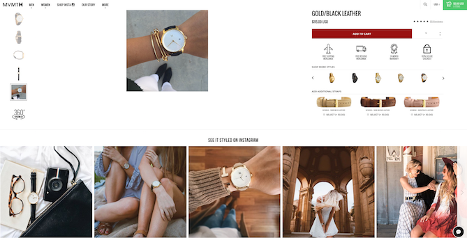
MVMT addresses this concern by surrounding their studio product images with pictures from Instagram.

By mixing UGC in with product pictures and including an Instagram feed featuring relevant social on each product page, MVMT allows shoppers to better understand the proportions of the product and imagine how they would style it.
Pro Tip:
Use social pictures with relevant reference points such as a hand or additional accessories that help shoppers understand the actual size and color of the product.
Samuel Hubbard Features UGC in Home Page Design
Uncertainty is a big factor when seeing an online brand for the first time. Authentic customer reviews are a perfect way to reassure new shoppers about the quality of your products and the trustworthiness of your brand.
When displayed on the home page in a way that matches the overall site design and experience, they capture the attention of site visitors and nudge them to take the next step in the customer journey.
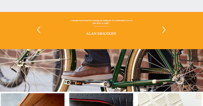
Samuel Hubbard features their customer reviews as a major part of their homepage design to showcase happy customers and encourage new site visitors to look further.

Pro Tip:
Feature detailed reviews that mention a specific use or benefit of the product such as gift giving or all-day use.
Campus Protein Measures Industry Pain Points
Each industry has its own unique customer pain points. Asking past buyers to rate specific metrics related to your industry as part of their product review provides shoppers with trustworthy and relevant information.
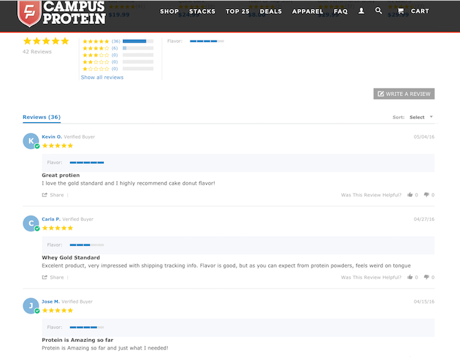
Campus Protein uses their review requests to get customers to weigh in on the flavor of their product. Flavor is a key component of purchase decisions when buying consumables online. By asking customers to rate the flavor of the product they bought, Campus Protein ensures that flavor is part of every customer review.
Industry-specific measurements enhance reviews and ensure that the most important information that can make or break a sale is communicated to new shoppers.

Comments
Post a Comment